
Public Calendar View
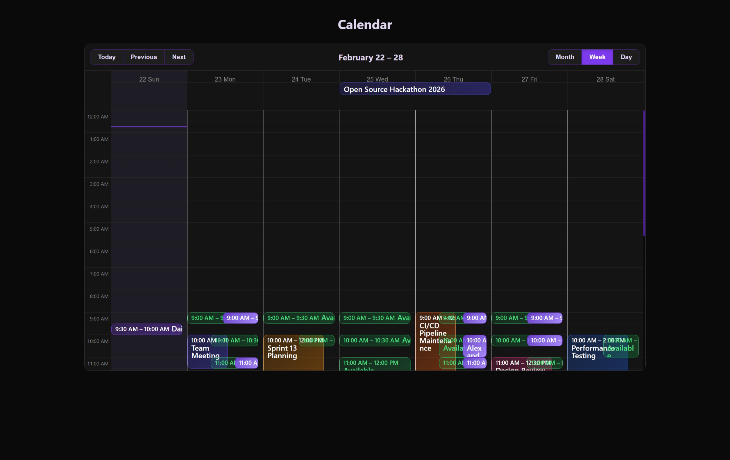
The Public Calendar is the read-only window into the system's schedule. It is designed for maximum accessibility and multi-view flexibility.
 Integration and sharing options for the public booking calendar.
 The clean, read-only interface used for guest-facing availability overview.
Viewing Experience
The calendar utilizes react-big-calendar with customized styling to match the application's premium aesthetic.
Available Views
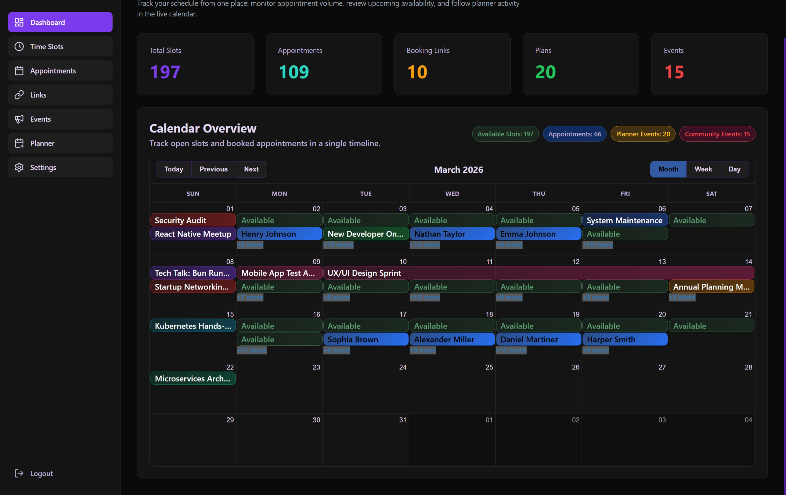
- Month: Traditional grid for long-term planning.
- Week: Best for seeing daily density and available slots.
- Day: Focused view for the current or selected date.
- Agenda: A list-based chronologically sorted view of all upcoming events.
Interaction & Navigation
Time Travel
- Navigation Controls: Quick buttons for "Today", "Previous", and "Next".
- Date Picking: Automatically updates the view when navigating through the interactive header.
Event Inspection
Clicking on any event (Slot, Appointment, or Community Event) opens the EventDetailsModal:
- Deep Dive: Shows titles, times, and descriptions.
- Contextual Info: Indicates the type of event for better clarity.
Internationalization (i18n)
The calendar labels are fully translated:
- Labels: "Today", "Month", etc., adapt to the user's language.
- Date Formats: Automatically adjusts based on the
culturesetting (e.g.,tr-TRoren-US). - Show More: Handles overlapping events with a localized "+N more" label.
Technical Architecture
usePublicCalendarPage Hook
- State Coordination: Syncs the current date, selected view, and highlighted event.
- Event Fetching: Aggregates all public-ready items (Approved Community Events, Public Slots) into a single array for display.
- Style Getters: Dynamically assigns background colors and borders to events based on their type and status.
Display Constraints
To ensure performance, the calendar typically limits its search range to the current view's window, fetching only what is necessary for the user's current context.